Resolution and Screen Sizes
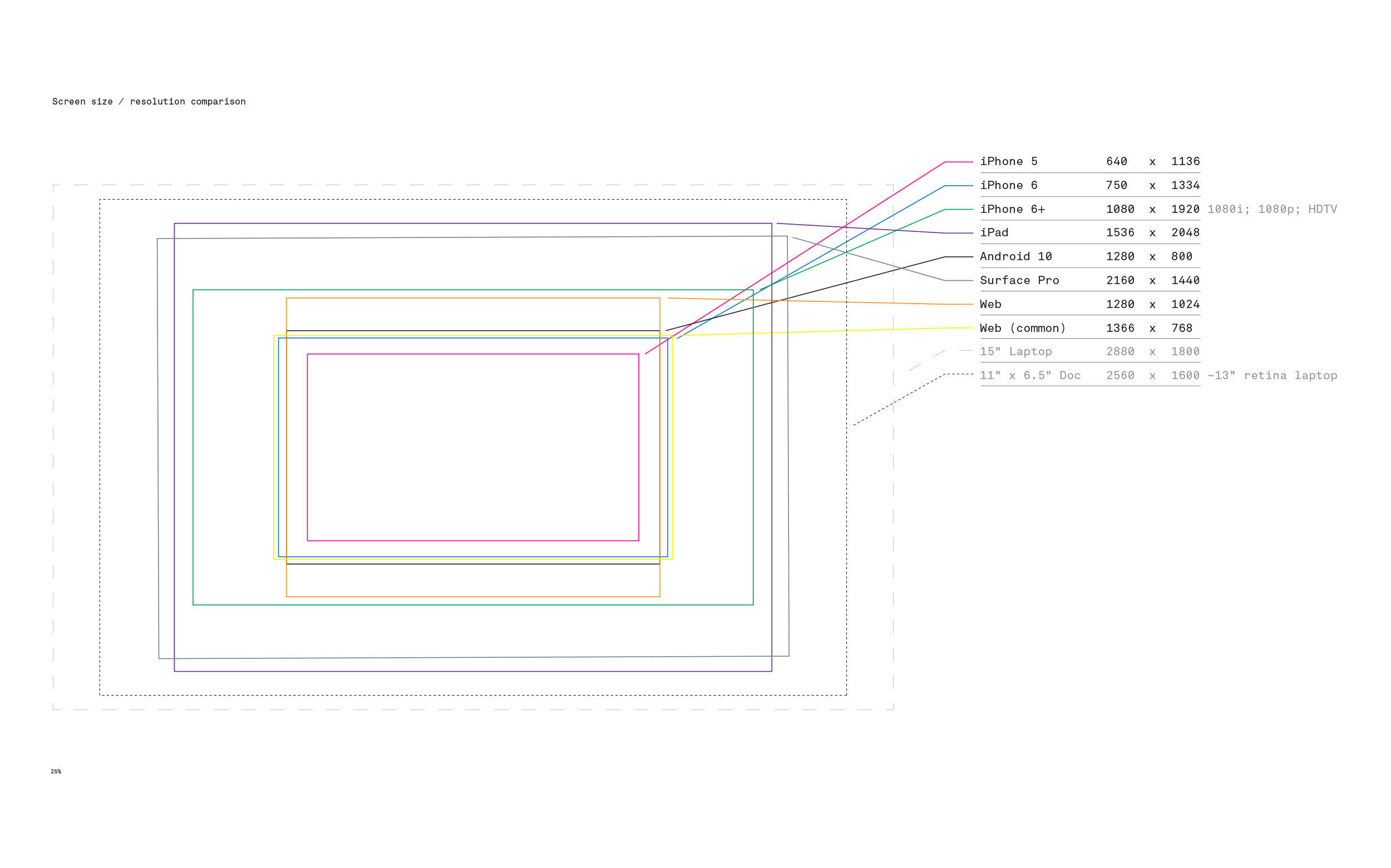
With such a wide array of possible screen sizes and resolutions on the market today, it's easy to see why there's plenty of confusion in regards to design approach. The illustration above is merely a small sampling of the possibilities (at the time of this article).
Mobile First
A mobile first design approach puts the experience of mobile devices as a priority over other experiences like desktops and tablets. This decision is typically, but not always, made on the basis of data that suggests mobile users are the most frequent visitors and the most engaged with the content you are serving.
Responsive Design
A responsive design approach is one where features and experiences are considered in a more holistic manner for users of various screen sizes and devices. In some cases, features that are included for the desktop browser are either paired down or completely eliminated from the mobile experience. Most often, however, the design approach considers content and experiences and how they would work for all. Considerations are then given for how these pieces of content function on a variety of devices.
Design in Browser
We must mention that there is quite a bit of discourse on a design in browser approach. This is usually accomplished with creating new content on the basis of a suite of existing styles and layouts to work with directly, or by using applications that style elements within the context of a WYSIWYG (what you see is what you get) editor or browser based application. In fact, over the past few years there have been a host of new content editors of this type.
Our Position
We see the generalized approaches above as one and the same. We place emphasis on content. We believe that the users and personas should drive the experience, not the devices. When developing websites or other web applications and experiences, we focus on features and content parity within the context of the people using them, with accessibility to these features and content in mind.
Resource
A full list of comparable screen sizes can be found at dpi.lv
Tags
Accessibility
Web Design
Responsive Design